TRENDS + INNOVATION
1. Inspired minimalism: less ink, more texture.
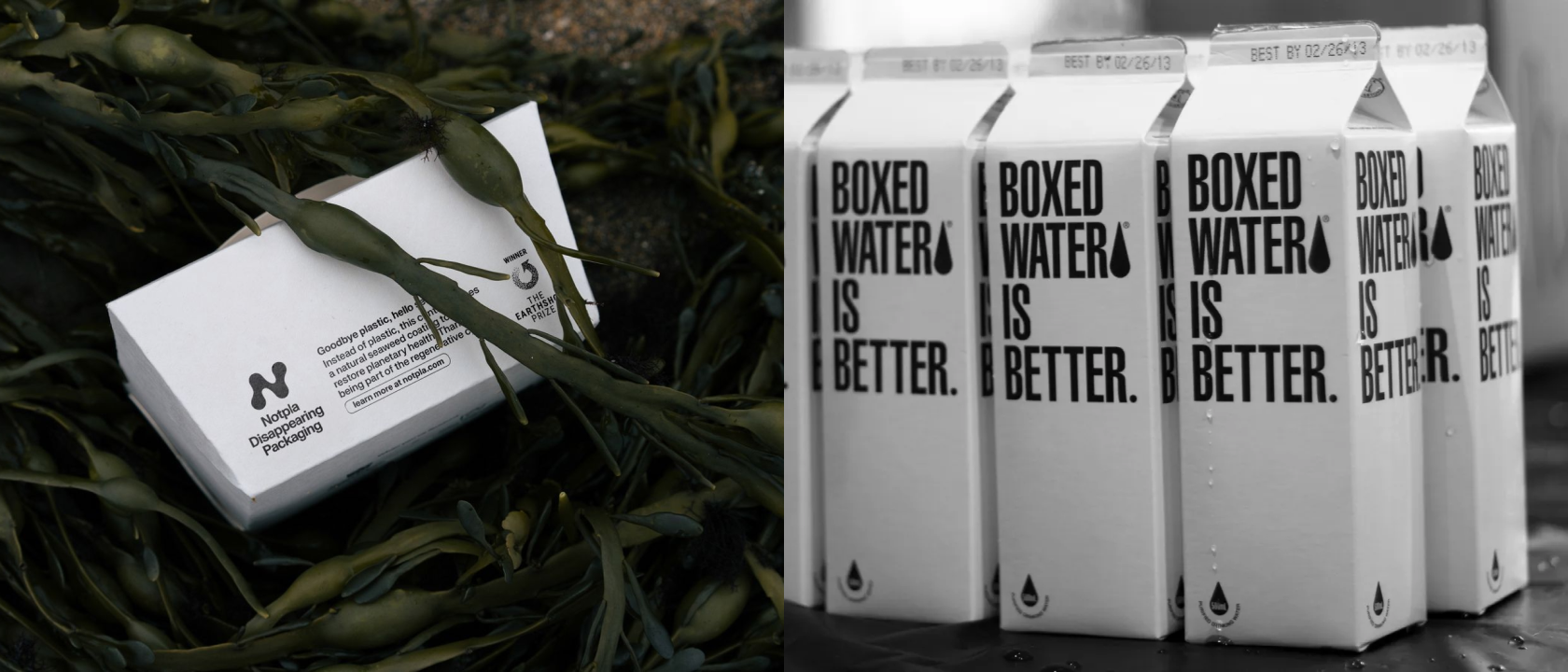
Inspiration: Boxed Water is Better, Seed, and Notpla
More and more product brands are taking cues from how produce is packaged: minimal materials, compostable elements, and texture-forward design.
- Less full-bleed ink, more blank space
- Compostable stickers instead of printed boxes
- Labels as the main design layer, not plastic wrap
Why it works:
It’s tactile, intentional, and honest. It sends the message: “We care more about the contents than flashy waste.”
2. Kraft paper everything (with one-colour print).
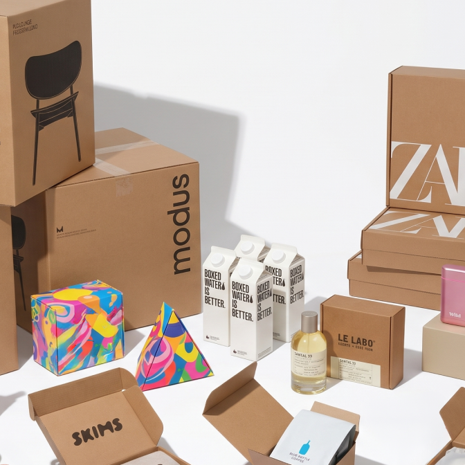
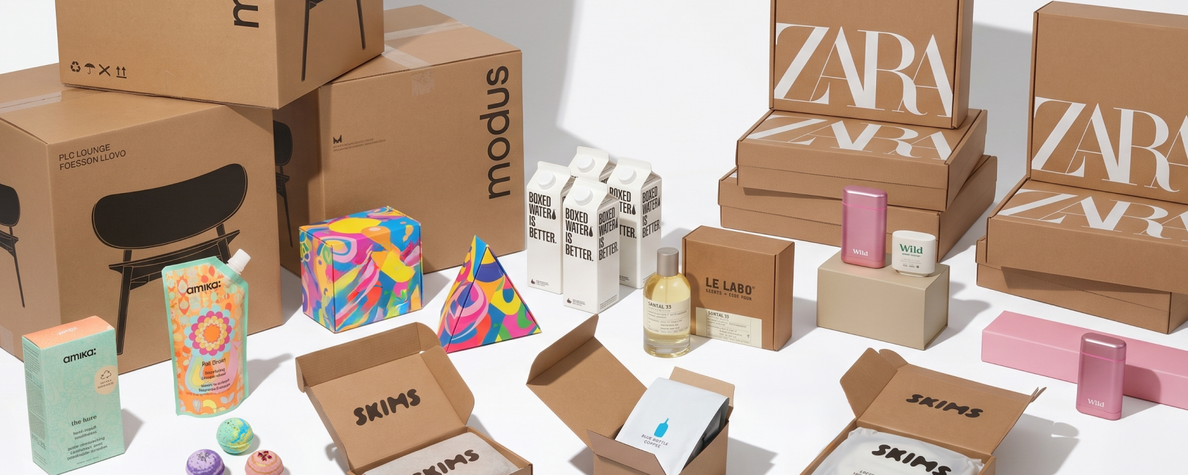
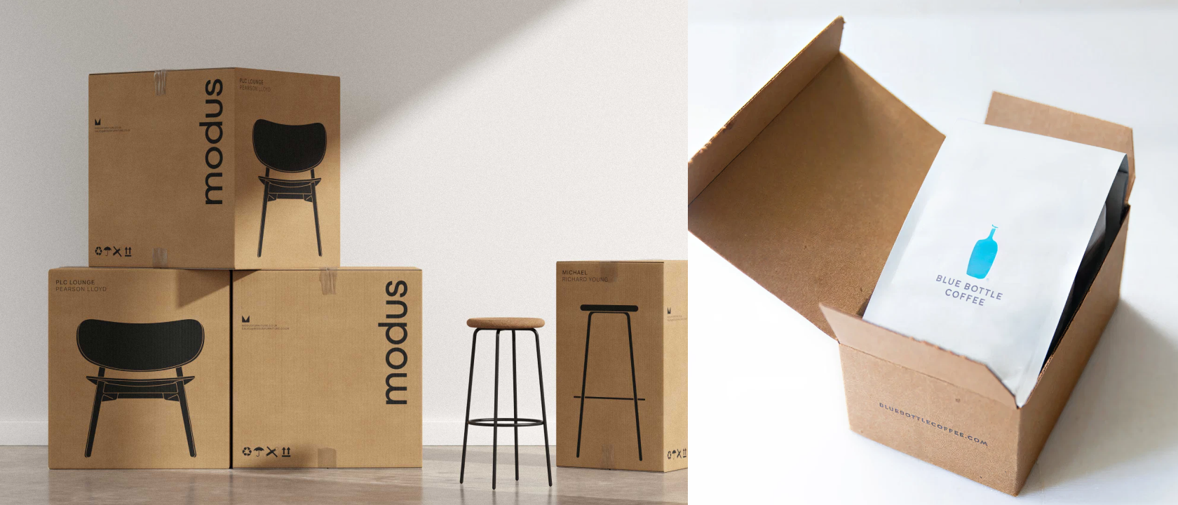
Inspiration: Zara shipping, Modus, Dr. Bronner’s, Blue Bottle’s shipping experience
Using unbleached, uncoated kraft paper with a single ink colour is a classic, and still effective, eco strategy.
- Reduces printing emissions
- Often recyclable or compostable
- Has an instantly “clean and conscious” visual tone
Design tip:
This approach puts pressure on typography and layout. With fewer design levers, clarity and hierarchy become your tools.
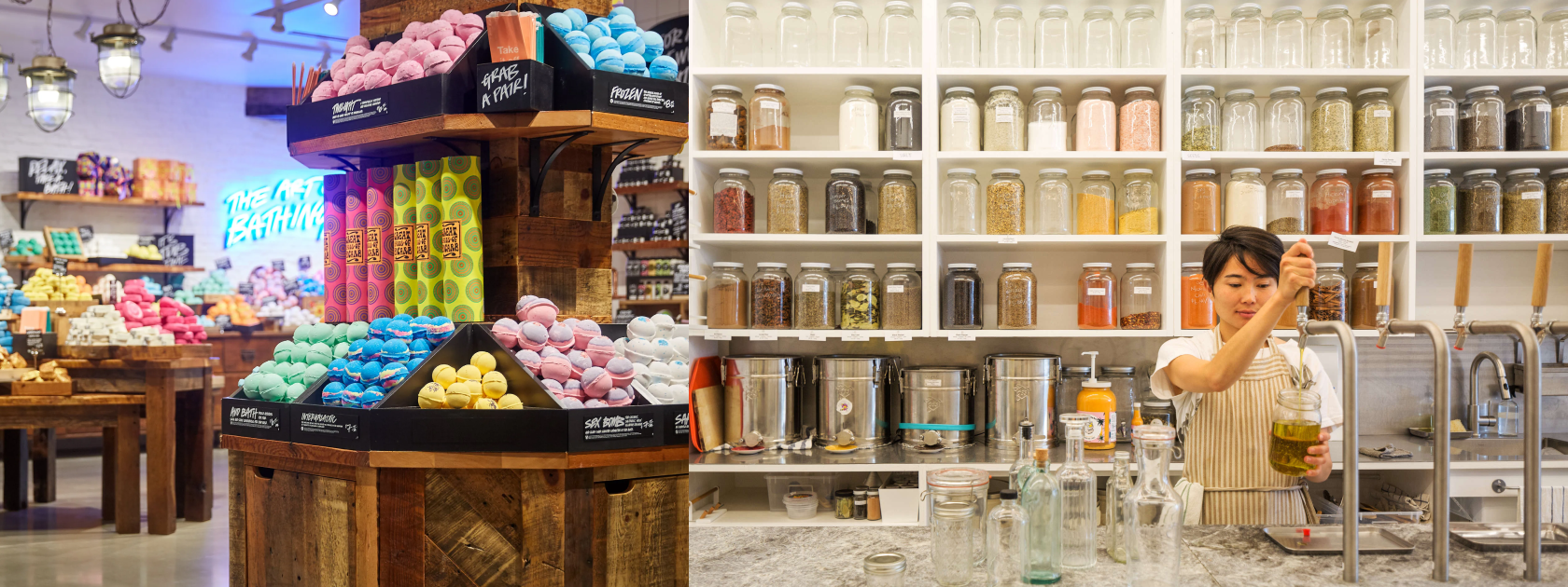
3. No box at all (minimal outer packaging).
Inspiration: Lush Ltd., Cadence, Pattern Brands, Zero Waste Stores
This is a growing movement: if your product is durable or ships well on its own, ditch the box.
- Use printed tape on a basic mailer
- Rely on the product’s own packaging to do the brand work
- Avoid secondary “presentation layers” that go straight to landfill
Why it works:
No extra box = lower cost + lower footprint. It also signals confidence in your product. You're not overcompensating with fluff.
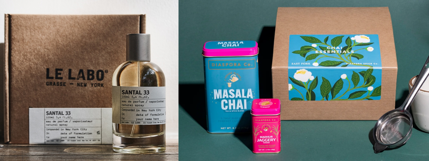
4. Brand the sticker, not the packaging.
Inspiration: Le Labo, Anecdote Candles, Diaspora Co.
For brands using glass jars, refill systems, or kraft bags, the label or sticker becomes the primary branded asset.
- Printed in bulk and applied across SKUs
- Allows for flexibility in small-batch runs
- Easy to swap out without changing base materials
Why it works:
It’s scalable, affordable, and smart. And when done right (with great colour or illustration), it still feels premium.
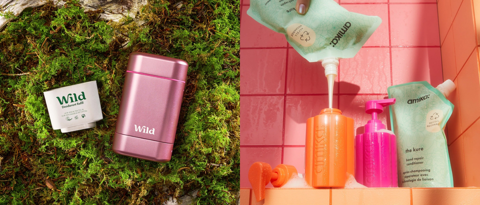
5. The “reused and reusable” system.
Inspiration: Loop, Wild, Amika
Some brands are leaning into reusability as identity, and packaging that’s meant to stick around:
- Heavy glass, tin, or aluminum containers
- Refill pouches (paper or mono-material)
- QR codes or loops for returning containers
Why it works:
It becomes part of the product story. “We designed this to last” is a message consumers are proud to buy into.
What’s right for you?
You don’t have to be 100% plastic-free or zero-waste to make a meaningful impact.
But you do need to be thoughtful.
If you’re building a commerce brand today, your packaging is a moment of truth:
- It touches your customer before your product does
- It tells them what kind of business you are
- It’s your first, physical impression